Open Frequency
I turn a repeated wave into a flexible festival identity that holds many voices within one recognizable signal.
Independent creative direction, identity & campaign study
Identity, motion and campaign
01 / Idea, problem & leadership
What needed to change.
- My role
- Independent creative direction, identity & campaign study
- Disciplines
- Brand · Motion · Play
The central idea
The festival identity balances expressive variation with the practical structure of a changing program.
- Designed for
- Visitors discovering music, performance and moving image, alongside those looking for a particular event.
- Scope of this study
- Independent creative direction · Festival identity · Program hierarchy · Motion identity film
- What is shown
- The work brings together a completed 15-second motion identity, poster applications and original identity and campaign boards.
Make room for different voices
I want a festival identity to introduce unfamiliar work, distinguish events and help visitors find what comes next. My brief asks how much variation a system can accept before the festival disappears. I fix the name, colour relationships and underlying wave rule, then let scale, crop and rhythm respond to each format.
02 / Thinking, evidence & concepts
Making the thinking visible.
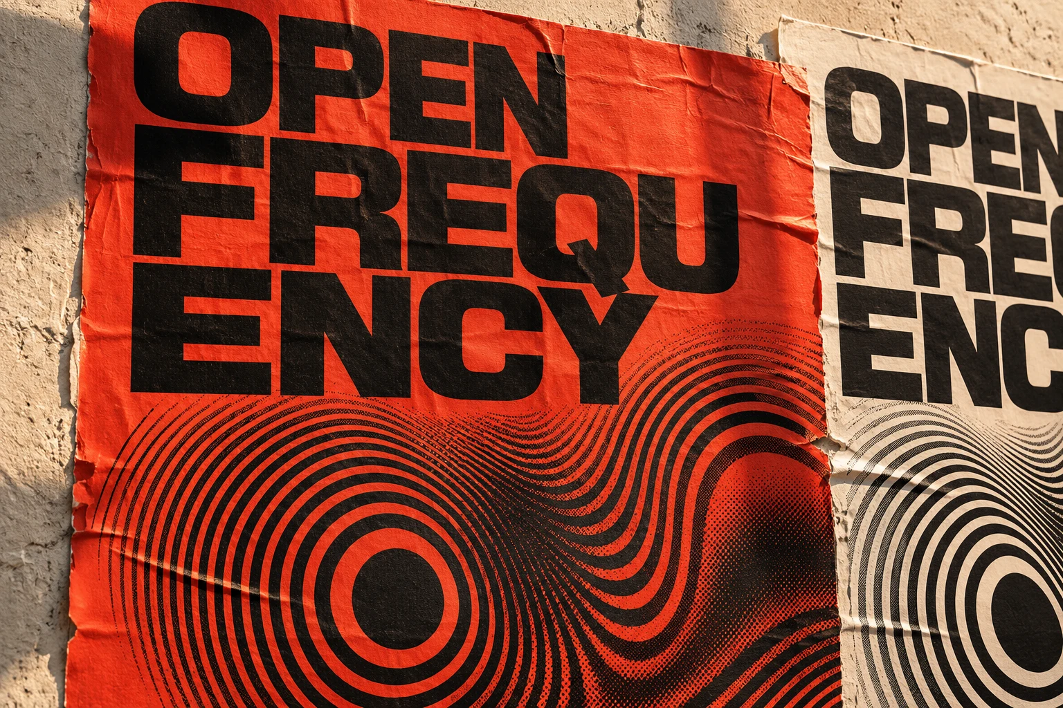
The wave, typography and information hierarchy work together across print, space and motion.
Build a graphic language that behaves
I use repeated curves that can expand, compress and cross a frame. Oversized type announces the festival; a consistently aligned secondary layer explains its program structure. Vermilion supplies street-facing presence, while ivory gives longer text room. In the completed 15-second film, the wave becomes a transition device, extending the identity's existing logic instead of adding animation as a separate effect.
Visual description
OPEN FREQUENCY — Many voices. One signal. 15-second silent motion identity. 0:00-0:00.7: OPEN and FREQUENCY sweep in from opposite sides, scaling into a large black title. Broad vermilion and ivory rings surge outward beneath the ivory panel. 0:00.7-0:03: The opening title holds while the optical rings rotate, travel and pulse. 0:03-0:03.7: The title sweeps away and the panel wipes to vermilion. The wave center shifts decisively to the left. 0:03.7-0:05.8: MUSIC slides in from the left with sequence marker 01/03 and a smaller OPEN FREQUENCY lockup above. 0:05.85-0:07.95: PERFORMANCE slides in from the right with marker 02/03. The wave center moves right and the rings broaden. 0:08-0:10.15: MOVING IMAGE rises into view with marker 03/03. In portrait, the two words are stacked. The rings shift back toward the center. 0:10.2-0:11.75: The panel returns to ivory. OPEN and FREQUENCY sweep back from opposite sides, followed by Many voices. One signal. 0:11.75-0:15: The final lockup holds while the waves continue with a restrained rhythmic pulse. Throughout, the bottom strip reads CONTEMPORARY ARTS + ELECTRONIC MUSIC. There is no speech or soundtrack.
The poster system moves from the entrance and foyer to the street.
03 / Solidified direction
A public signal with many voices
I keep the name and information anchors stable while allowing a repeated wave and emphatic typography to vary. The system must accommodate different kinds of work without losing the festival itself. A protected program zone is therefore as important as the expressive poster gesture.
Current art-direction rationale · developed for this portfolio revision, October 2026.
Creative direction / Decisions
The choices behind the work.
Create variation from one rule
I vary wave spacing, scale and crop instead of inventing a new motif for every format. Coherence becomes easier to maintain, but templates need limits so expressive variation does not become visual noise.
Protect the information layer
I reserve clear zones for program text rather than placing every detail inside the waves. Some layouts lose graphic spectacle, but the hierarchy can accommodate changing information without rebuilding the identity.
Keep the disciplines connected
I distinguish music, performance and moving image through written labels within a shared system. This keeps the festival visible as one event, while asking typography to carry more of the organisational work.
04 / Final result & next test
Many voices. One signal.
The completed 15-second motion identity, poster applications and identity boards bring the festival system together. Rhythmic optical waves, directional type transitions and clear category labels connect music, performance and moving image.
Challenge it with practical formats
I would test a dense timetable, small mobile listing and distant wayfinding sign before treating this as a complete event system. My evaluation would ask whether people can locate categories and essential access information without decoding the graphics. Contrast, motion sensitivity and thin-line pattern behaviour need review.
The completed 15-second silent motion identity extends the same graphic language across landscape and portrait formats.
Credits & context
Creative direction, identity, motion and campaign design by Chi Alexander.
Keep exploring