Clearframe
I’m exploring how creative teams could turn scattered feedback into an actionable decision.
Independent product design and creative direction
View presentation · 8 slides / Downloadable PDF
Original static design specimens · illustrative content · not a shipped product
Self-initiated product concept
A clearer view of the review.
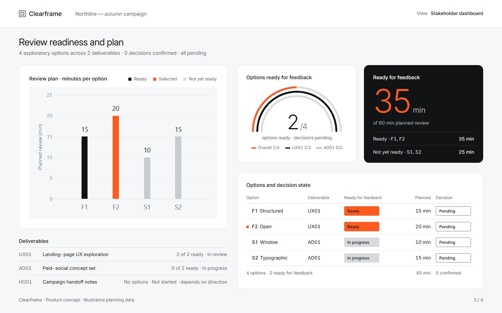
The current visual studies separate what is ready for feedback, the time planned for review and the decision state.
Interface concept · illustrative content · not a live product. Northline is fictional. Readiness never implies approval.
- Planned review
- 60 min across four options
- Ready for feedback
- 35 min within that 60-minute plan
- Recorded decisions
- All Pending · 0 confirmed
Type and identity
Aa Inter
Light / Regular / Medium
The existing nested-square mark and plain wordmark carry the identity. Inter gives the interface a quiet, precise voice.
Color and emphasis
#F6F7F9 Surface
#111314 Ink
#FF5A1F Signal
Orange draws attention to review status or a selected option. A separate Pending label keeps the decision state explicit.
Earlier decision-record study
This earlier Northlight poster specimen explores comments and decision records. Its cobalt and chartreuse styling predates the current cool-gray and orange direction shown above.
Interface concept · illustrative content · not a live product
Clearframe · precision review instrument
Feedback with somewhere to go.
One review, top to bottom: what changed, where the feedback points, and the decision that was recorded. The project and people are fictional.
Project
Northlight
Spring poster series
Versions
- v4 Latest
- v3 Previous
- v2 Archived
LIGHT
What changed in v4
- Headline moved to the top left
- Sun shape enlarged and warmed
Decision recorded
- Decision
- Keep the larger sun; reduce headline weight.
- Rationale
- The sun carries the series; the headline only needs to be found.
- Owner
- Mira, creative lead
- Next action
- Prepare v5 for one final review.
Can be reopened with a stated reason.
- Cobalt marks the current location and selection.
- Chartreuse is reserved for a recorded decision.
01 / Idea, problem & leadership
What needed to change.
- My role
- Independent product design and creative direction
- Disciplines
- Product · UX / UI
The central idea
My workspace proposal connects the asset, its feedback and the next decision.
- Designed for
- Designers, creative leads and collaborators reviewing evolving digital work.
- Scope of this study
- Self-initiated Product/UX concept · Review journey · Information hierarchy · Decision-record study
- What is shown
- Self-initiated product concept. The current work includes four approved readiness and planning studies, the Clearframe visual direction, and an eight-slide presentation. The review journey and decision-record exploration remain design hypotheses. Research, usability testing and performance evaluation remain future work.
The cost of an unclear review
My brief starts with a coordination problem: teams can collect feedback while struggling to agree on what happens next. The commercial hypothesis is that clearer review outcomes could justify a focused workspace.
02 / Thinking, evidence & concepts
Making the thinking visible.
These visual studies explore a design hypothesis. No interviews, usability tests or commercial outcomes are claimed.
One complete review journey
I would prototype opening a project, understanding what changed, comparing feedback and recording a decision. I keep task management outside the initial scope so the review journey can remain legible and testable.
03 / Solidified direction
Readiness, planning and decisions
Cool surfaces, near-black Inter typography and restrained orange emphasis organize the current direction. A thin semicircle shows readiness; slender bars show planned review time. The decision column remains separate and Pending. In the daily view, a black capacity line gives the planned bars context. These are planning studies, not approvals or measured results.
Current art-direction rationale · developed for this portfolio revision, October 2026.
Creative direction / Decisions
The choices behind the work.
Give the work visual priority
I use cool surfaces, near-black text and restrained orange emphasis to separate review readiness, planned effort and decision state. The thin semicircle and slender bars share one information hierarchy. Contrast and keyboard focus would still need prototype testing.
Make change the entry point
I propose a concise version summary before the full discussion. This could help returning reviewers orient themselves, but it requires reliable version history and clear ownership of the summary.
Separate comments from decisions
I give a recorded decision its own state and rationale. That adds a deliberate step, but should reduce ambiguity about whether a suggestion has actually changed the direction.
04 / Final result & next test
A coherent concept. An honest next step.
Four approved static studies, the Clearframe visual direction and an eight-slide presentation with a downloadable PDF form the current deliverables. The proposed review journey and earlier decision-record study remain design hypotheses. This is a self-initiated product concept; no research, shipped functionality or measured outcome is claimed.
Questions before claims
I would ask reviewers to identify the latest version and explain the next action. I would test conflicting feedback, unresolved comments and reopened decisions before drawing conclusions.
The published work here is a static concept study and presentation. Separate motion production is not included in this case study.
Credits & context
Self-initiated spec work. Original interface compositions and workflow studies developed for this portfolio. No client commission, launched software or measured outcome is implied.
Keep exploring
Anchored comments
Mira The headline competes with the sun now.
Unresolved
Jon Bands read better than in v3.
Comment, not a decision